


James Bradwell voices multiple characters in Arc Games’ new release Chip 'n Clawz vs. The Brainioids!
16th October, 2025
9th August, 2024
Our new logo reflects the friendly way we approach our work and our relationships, the solidity and clarity we aim for in business, and the excitement of a journey to somewhere unexpected.
Playful, expressive, and 100% handcrafted, our new logo reflects the friendly way we approach our work and our relationships, the solidity and clarity we aim for in business, and the excitement of a journey to somewhere unexpected.
The relationship between the ‘O’ and the ‘i’ represents the elevation we strive for with all of our artists. The ‘i’ is rising upwards, cheered on by the O (so we like to think). Our animation tells this story better than words.
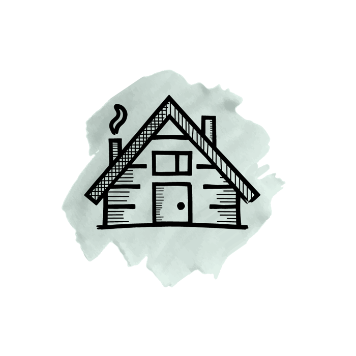
Our divisional icons give each set of artists a unique identity, status, and banner within Nordlings, with our watercolour brushstroke 'seal of approval' for quality and integrity.
The watercolour motif brings artistry, creativity, and something unexpected to our brand expression, a friendly counterpoint to the solid lines and clean typography that say ‘we mean business’. Watercolour says ‘but we’re fun, too’.

Our icons and brand elements are inspired by our director and company namesake’s Scandinavian heritage, with mountains and natural themes throughout.
Every new contract or new relationship is the start of a journey. There’s no telling where the path might lead.
A subtle translucency throughout all the icons and reflects our transparent approach to business, inviting the viewer in to join us on the journey.

Excellent talent has been an important part of our growth as an agency, and we had to keep a nod to it somewhere in our new brand expression.
This home feels like an appropriate beginning to a new chapter. As well as being somewhere for our beloved Len to live.

